As I Am Haircare Rebrand
A complete refresh of the As I Am haircare brand identity and packaging, using existing containers. We developed all from brand foundations to packaging, trade-show booths to social photography concepts, campaigns to online presence.
Services
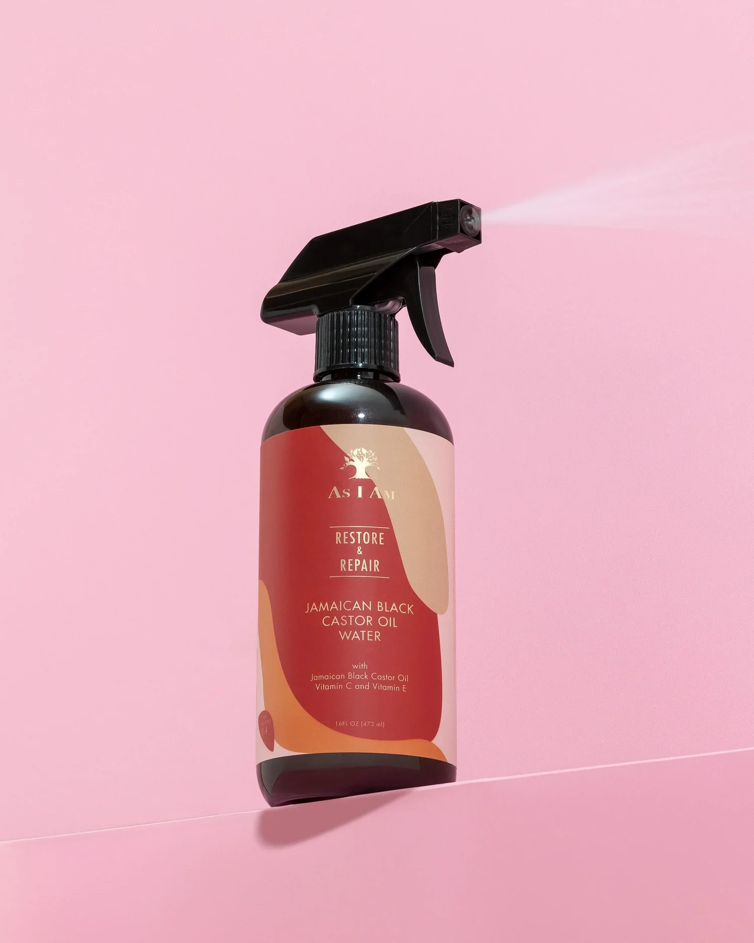
Brand Identity Development & Design, Digital, Packaging
Client
As I Am
Credits
Julien Baiamonte
Formnation
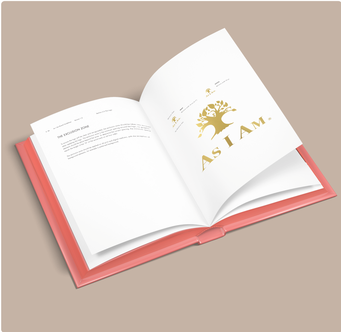
Starting with a renewed version of the old logo. We updated word mark as well as simplified the tree icon, in combination with the Futura type family.
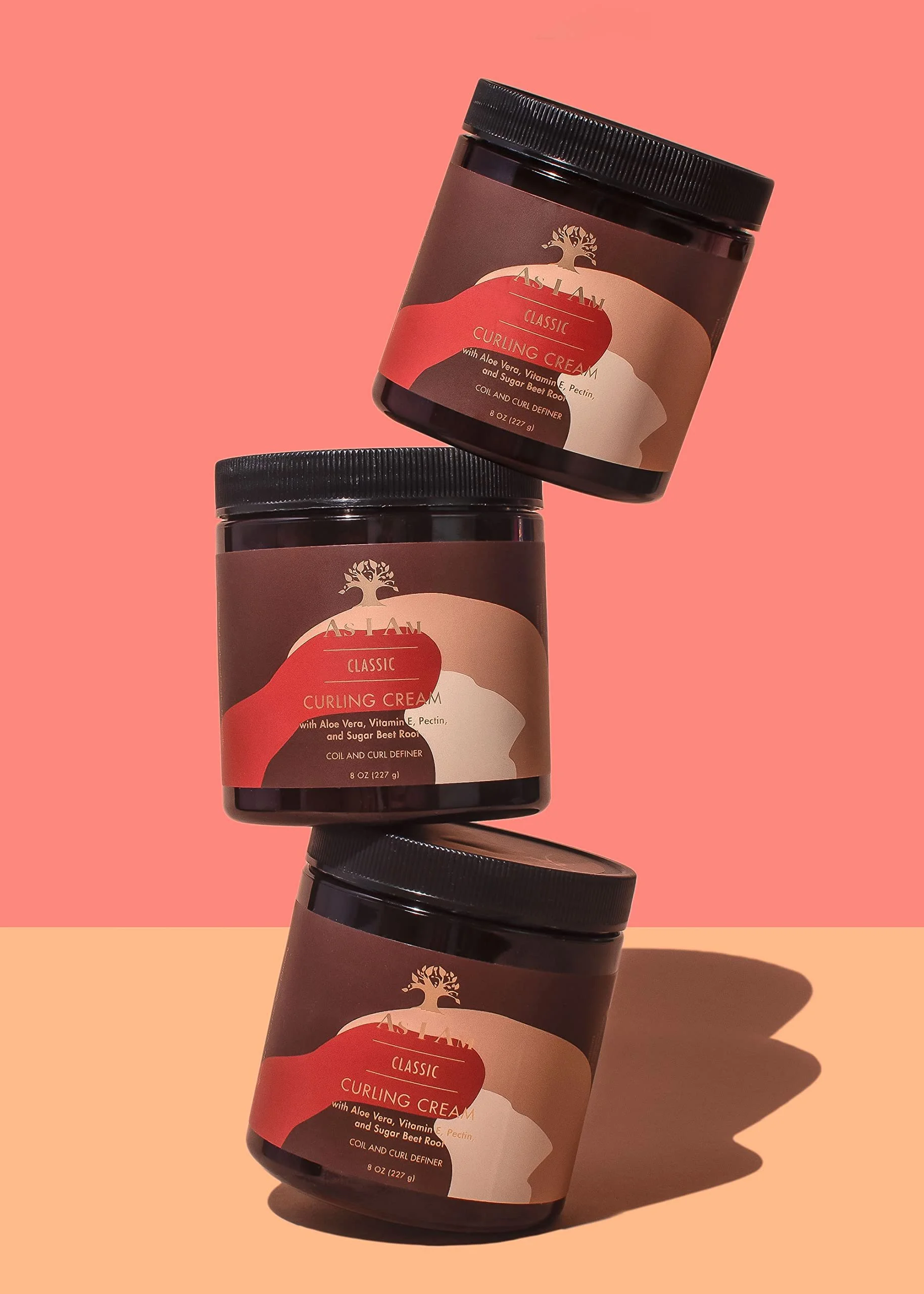
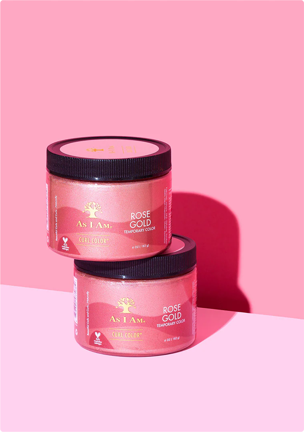
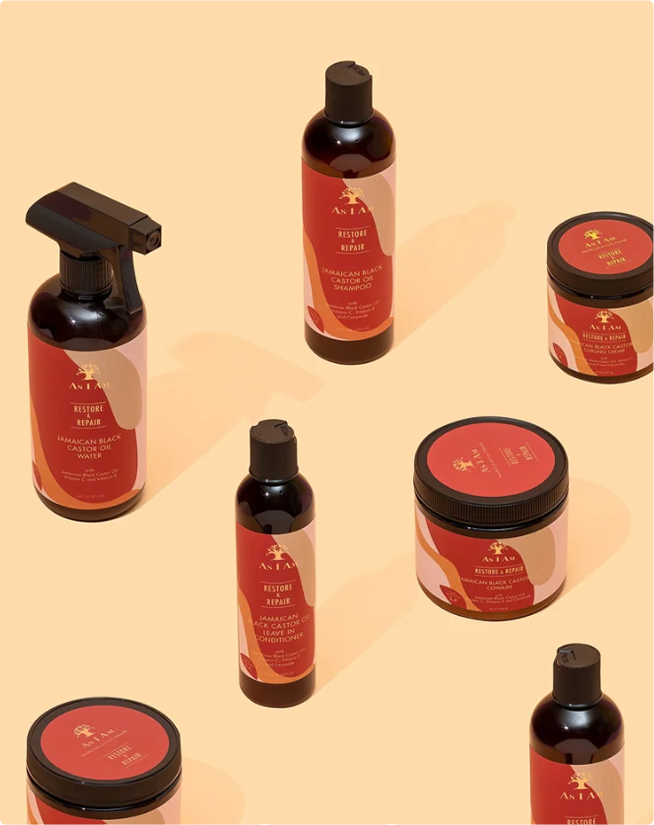
A Refreshed Look & Feel
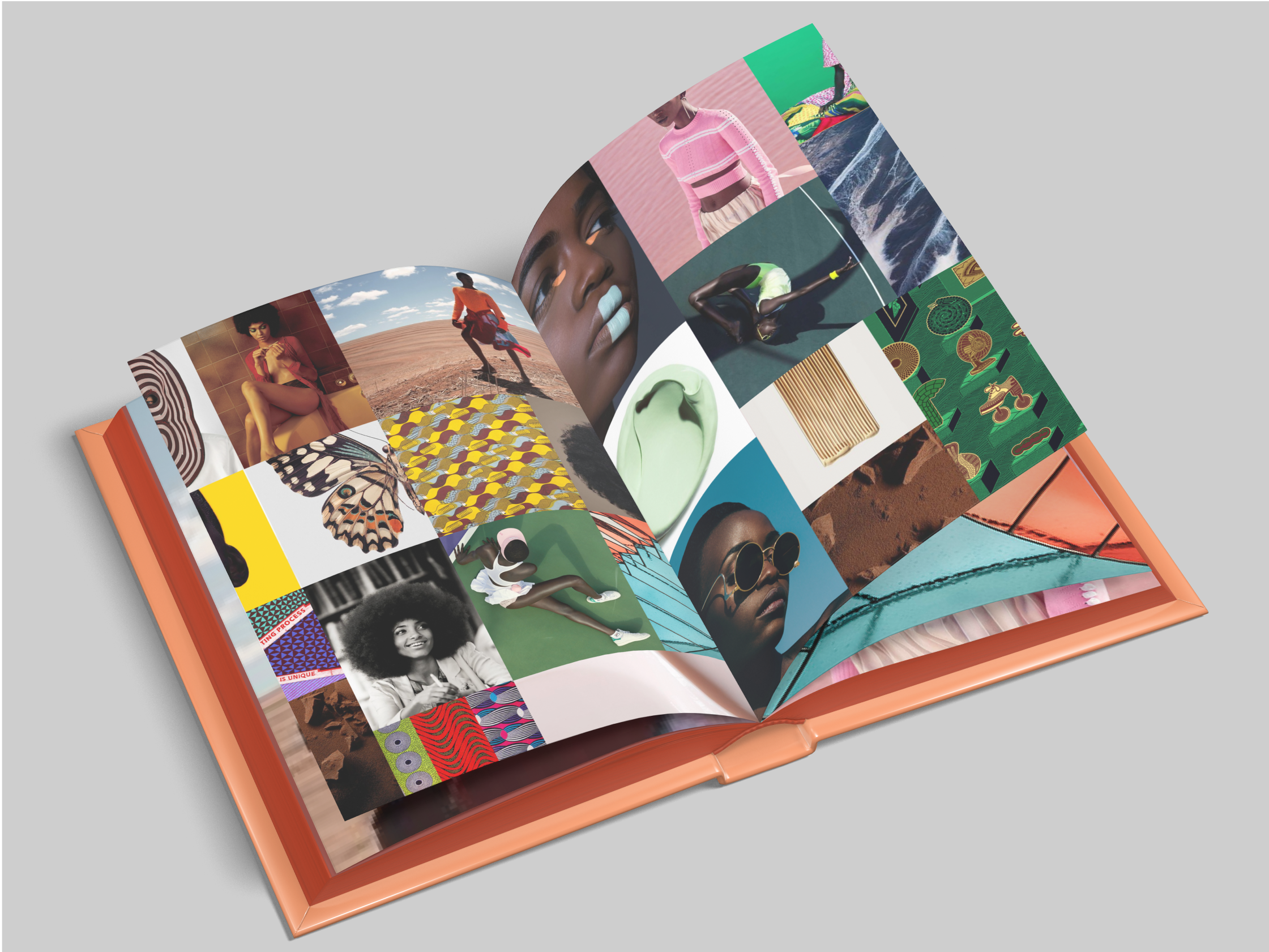
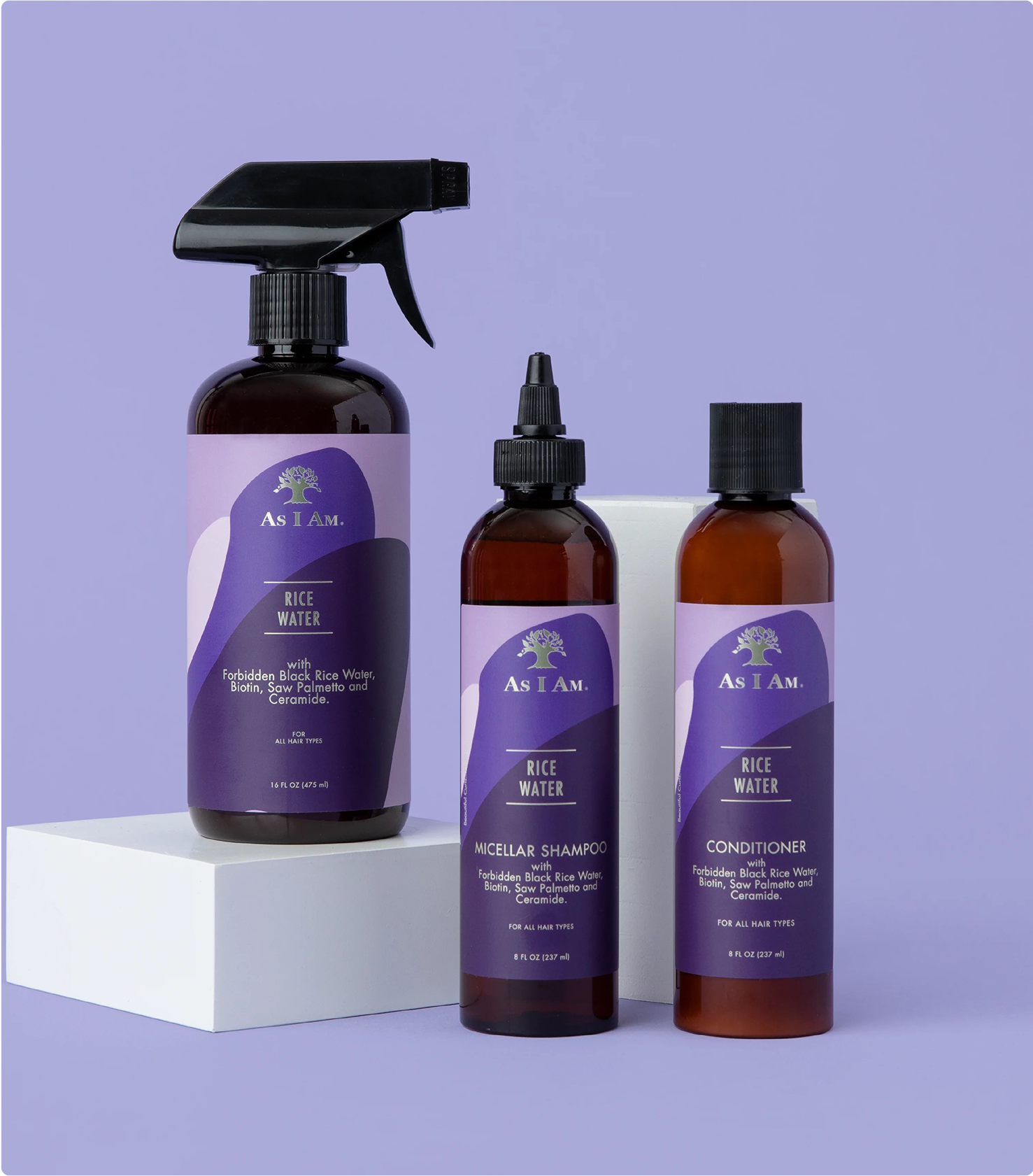
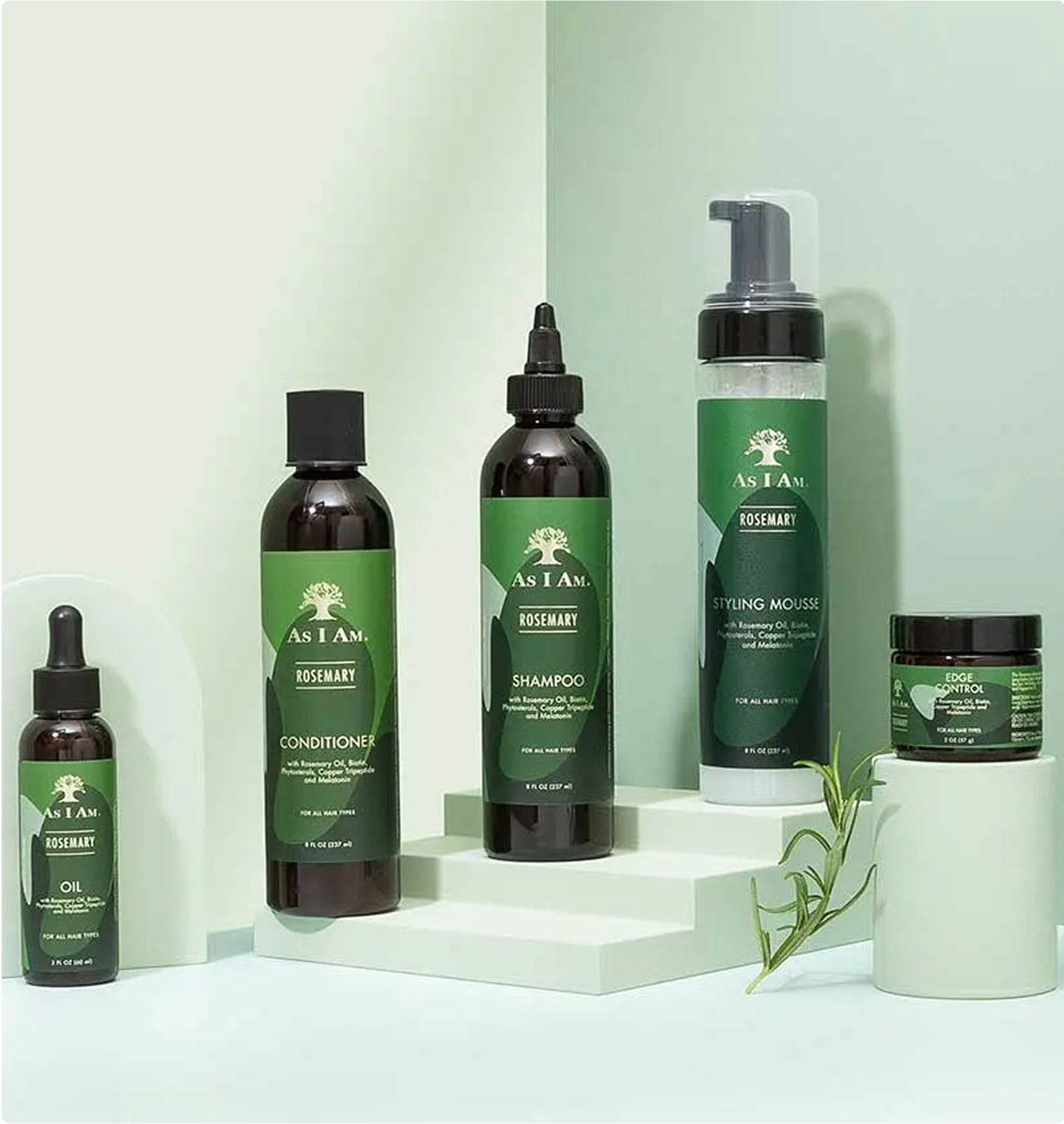
Reflecting the As I Am brand characteristics: fresh, bold, vibrant and dynamic. Inspired by traditional wax prints. Each As I Am Collection can be recognised and differentiated through it's colour and/or pattern.

About As I Am
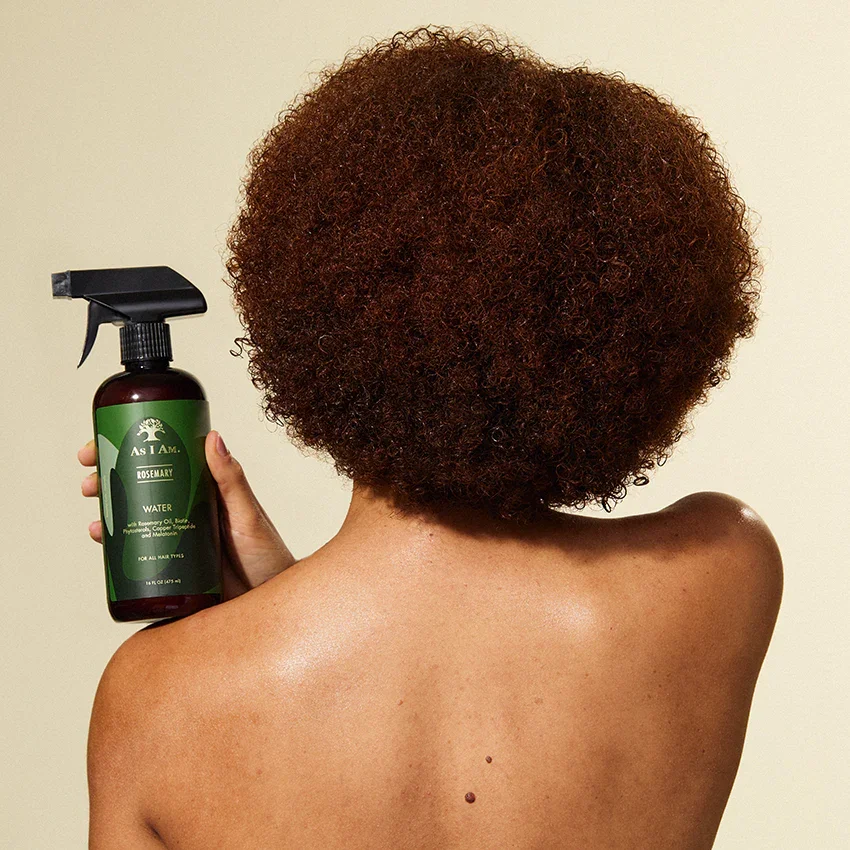
As I Am® offers natural ingredient focused haircare products for people of colour with naturally coily and curly hair textures. Who want access to products to easily live a natural lifestyle.
As I Am principles
-
Celebrating ones natural hair texture is a lifestyle for many. Embracing naturally coily and curly hair textures.
-
Adopting a healthier, more natural approach to personal care overall. Causing less harm to our body and planet.
-
As the logo suggests, it symbolises growth. Striving to grow as humans, and striving to grow coily and curly hair long naturally.
-
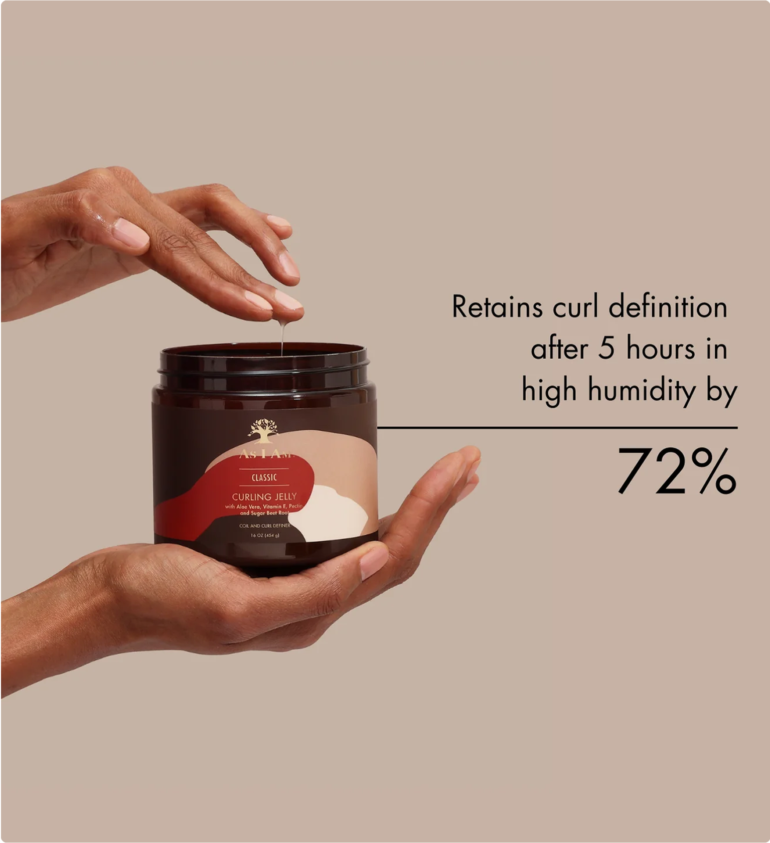
Research & development of curly hair products is at the centre.
-
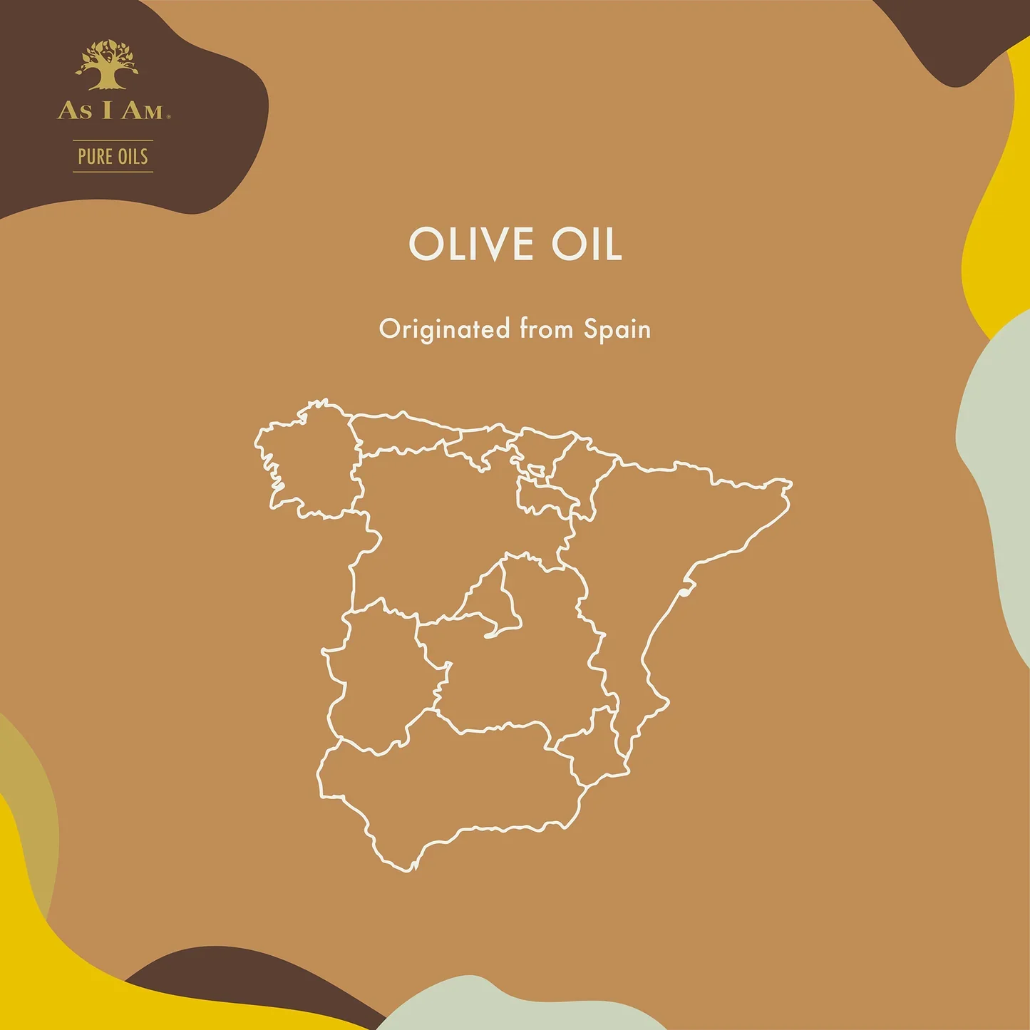
Warmth and richness is at the core of the brand. Not just in texture, consistency, also in expression. and community.
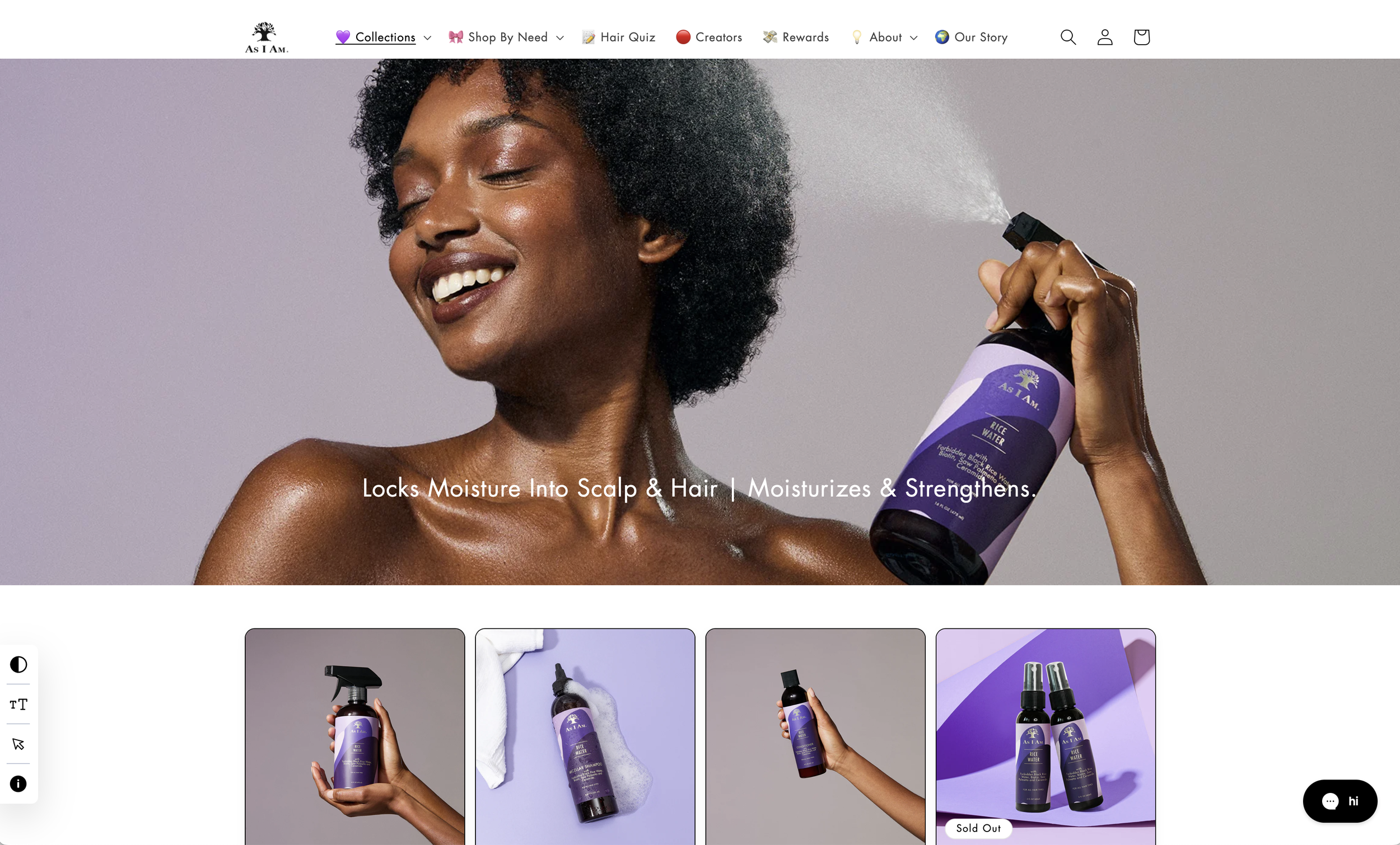

Web & Social
The refreshed As I Am brand vibe and product design shine through in its current look, photography, and packaging. It's exciting to see how this brand continues to evolve and grow!