
Electrolux Illustration Style
Branded illustration and animation style concept & development for Electrolux and *AEG reflecting the brand across physical and digital touch-points.
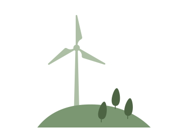
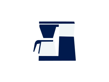
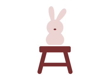
The illustrations were created as a modular library, making it easy for all designers to work with, and create artworks. The simplicity made them well suited for static and motion.
Services
Brand Identity, Creative Direction Print & Digital, Research, Design System
Awards
Red Dot Best of the Best →
Pentax Silver Award →
Guldägget Diploma →
Client
Electrolux
Credits
Electrolux Team
Joakim Olsson
BVD
Illustration System
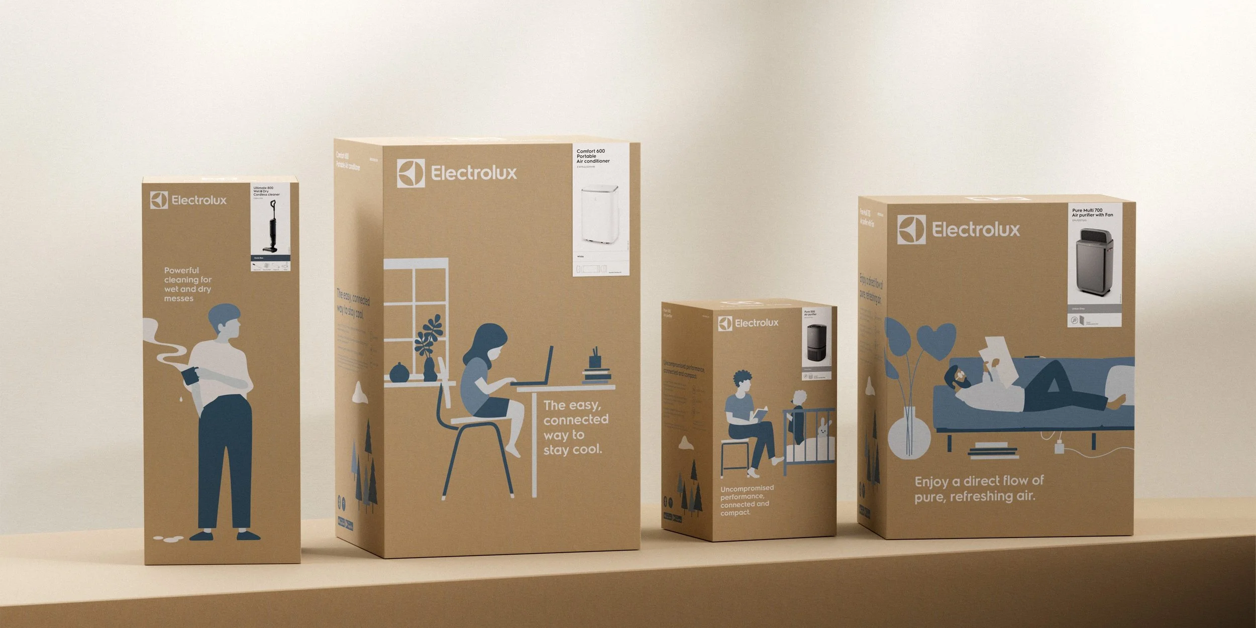
Together with Sweden based agency BVD, illustrator Joakim Olsson and the Electrolux in-house design team, we developed a flexible and modular expression based on everyday situations in and around the home. Creating a systemised approach to illustration. Which included characters of neutral gender, ethnicity, style and more, to illustrate situations for all humans.
Importance of illustrations & animations
Illustrations and animations are a great way to show the human side of things in a very simple way. It gives a brand extra depth, makes it more human and emotional. And it’s a more flexible way to express the brand. Express sensorial experiences like: scents, flavours, sounds, voices, heat, cold, effectively.
You can also with visualise less tangible concepts like: clean air, complex interactions, eco systems, connectivity and circularity and so on. And of course add a bit of ...humor.
In short a way to say a lot with less visual clutter. An added plus is that illustrations and animations take a lot less digital memory, can be edited and updated more easily than photography or film.


About Electrolux Group
Electrolux Group is a global home appliance company that has shaped living for the better for more than 100 years, with consumer brands including Electrolux, AEG and Frigidaire. Innovating in taste, care and wellbeing experiences across 120 markets.

A global scalable system
Create a systemised approach to illustration and animations to make it easy to be applied across both digital and physical touch-points, and the domains: taste, care and wellbeing,

Minimising ink & coatings
A style that works with a maximum of 4 colours for print on brown box packaging, the future of packaging.

One flexible inclusive style
Inclusive and flexible style characters of neutral gender, ethnicity, style and more, to illustrate situations for all humans