Electrolux Group Icons Library
One global Electrolux Group iconography library: interactive icons used across all *Electrolux Group brands and all appliances and digital platforms globally.
*incl. Electrolux,AEG, Frigidaire
Services
Brand Experience, Visual Design Language, Design System, Governance
Electrolux Group - FTE
Global Visual Design & Creative Direction
Credits
Electrolux Teams
Rob Bartlett
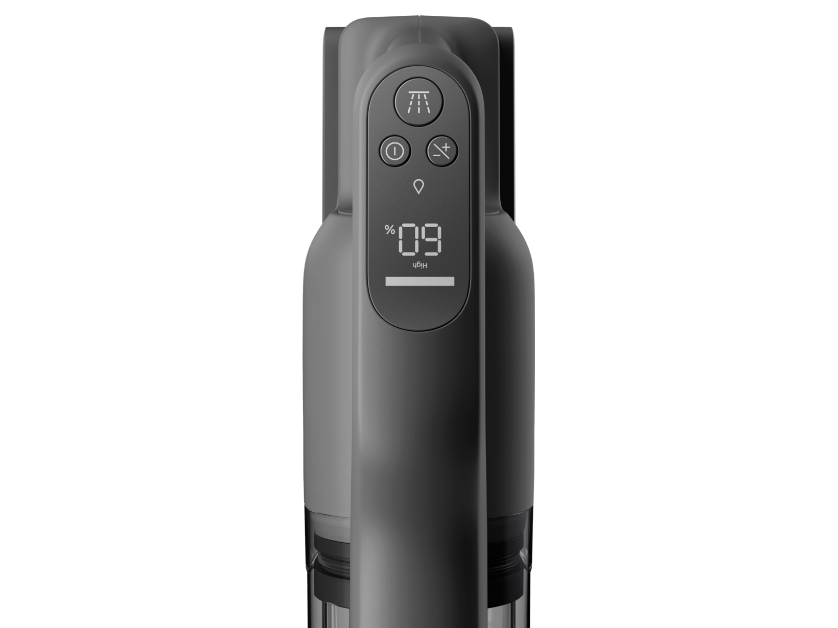
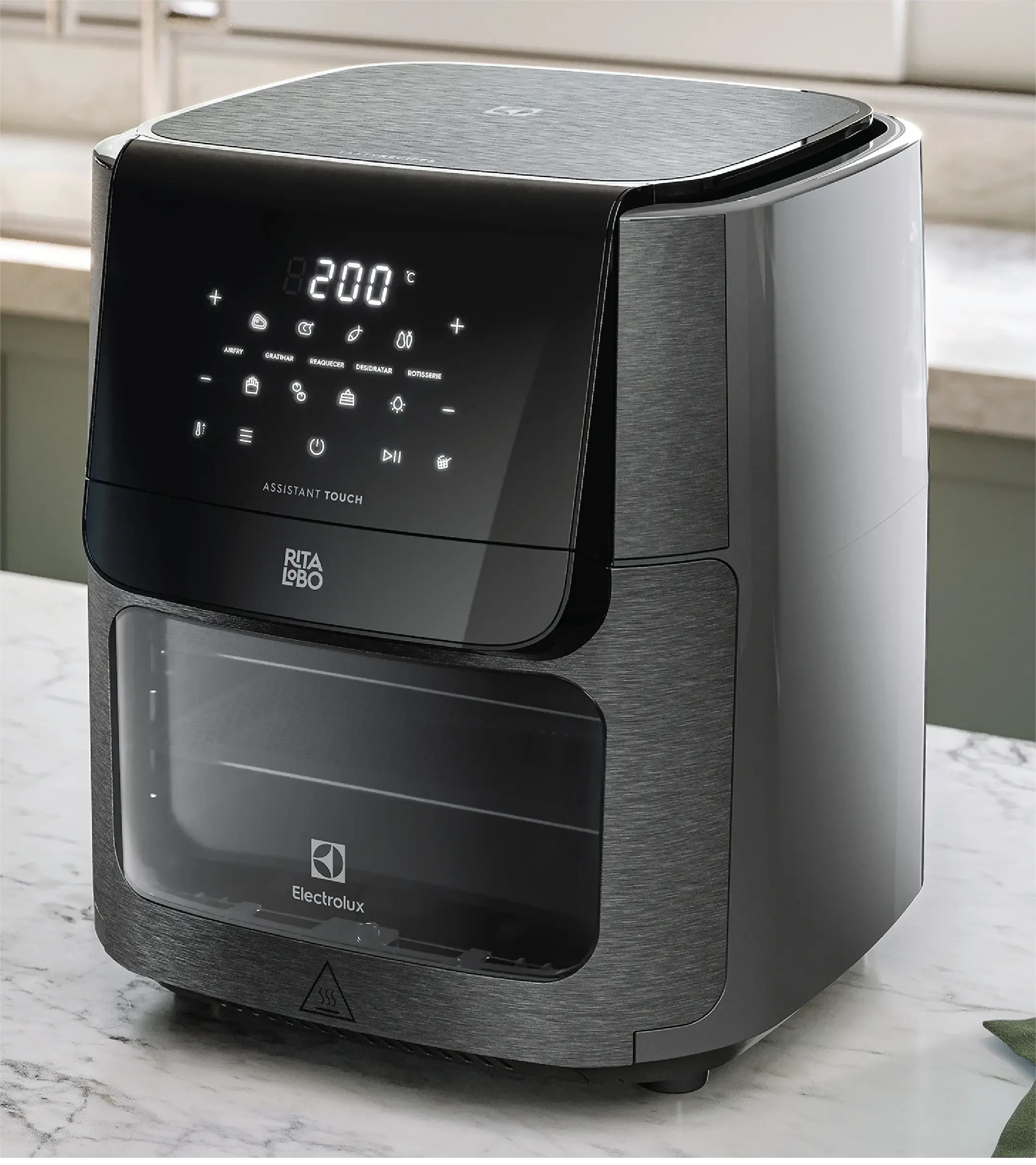
Consistent. Human. Intuitive. The new set of icons follow these principles in order to deliver an outstanding consumer experience. After all, icons are the #1 way consumers interact with the AEG, Electrolux and Westinghouse and other Electrolux Group brands.
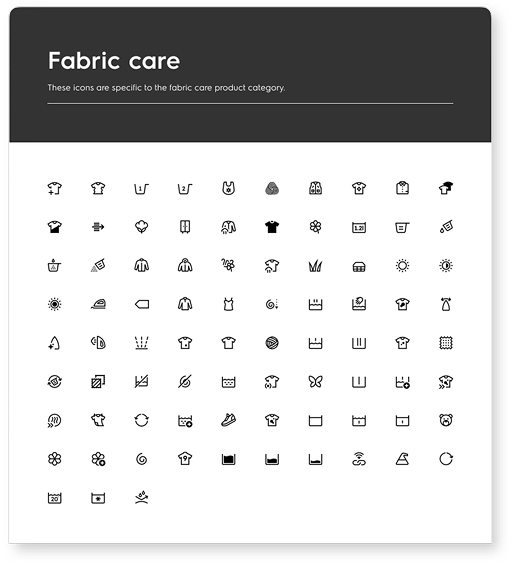
That’s why we developed a unified icon library – a single set of symbols to support actions on our physical and digital touch points – appliance UI, web and mobile. The shapes form a system, so that consumers meet them again and again, across Electrolux Group products. They’re easily recognisable, cohesive and inclusive.


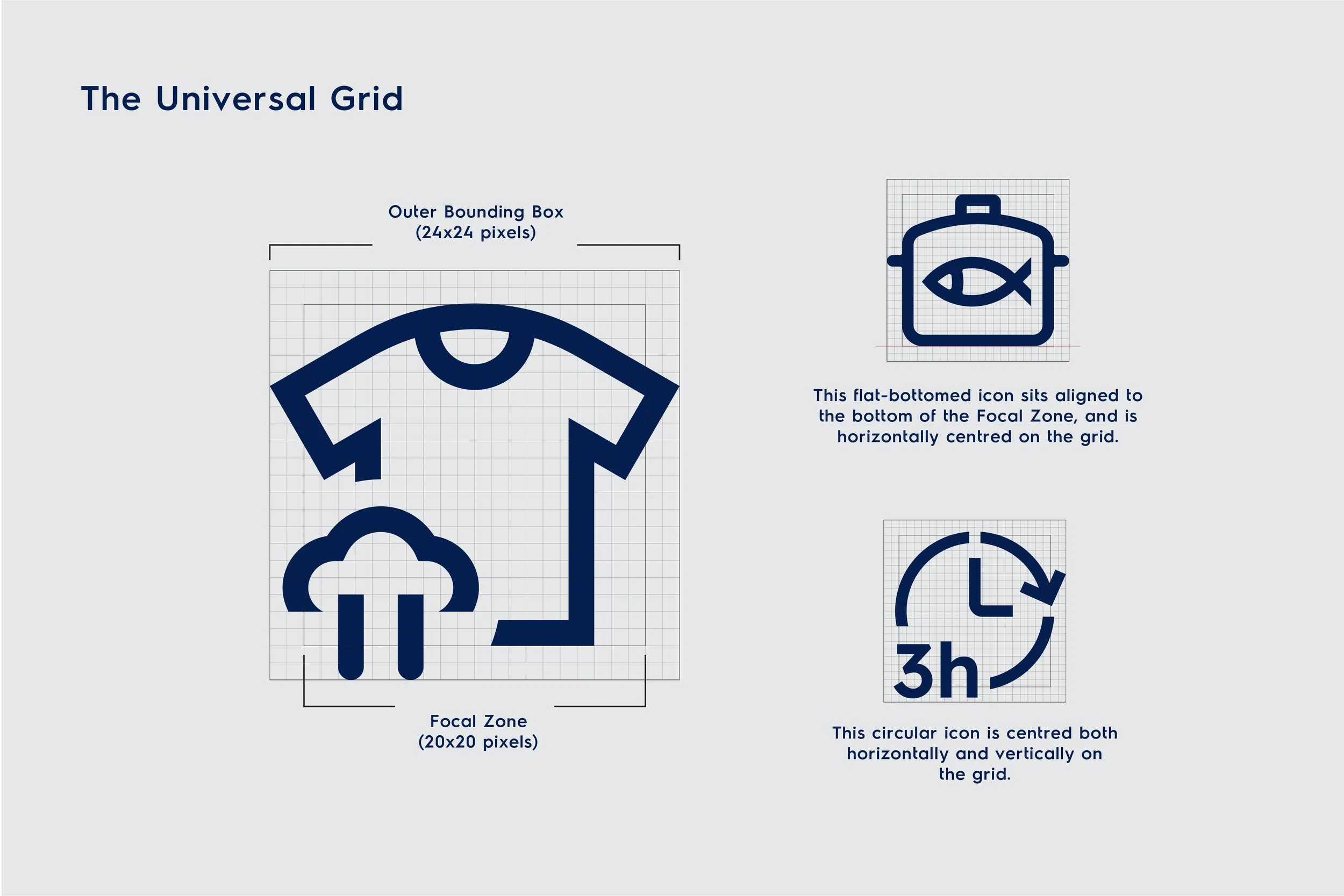
We soon started thinking about our symbols as interactive extensions of the industrial designs, crafted with the same levels of care and attention to detail.
Collaborating with a team with a rich knowledge and respect for iconography enabled me to focus all my energies on crafting symbols that are inherently human from every angle and truly global in their reach.-Rob Barltett

These small symbols need to be the best experience we can give to the user, whichever brand they interact with”
The goal was to reduce and rethink icons, not only to help us work more efficiently internally, but to enable consumers globally to recognize our brands, and enjoy the user experience.- Alissia Melka-Teichroew